
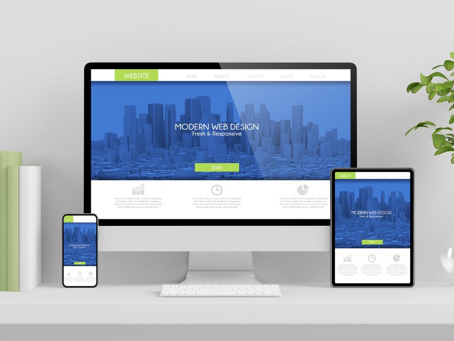
Minimalism in Web Design: Why Less Continues to Be More
Minimalism in Web Design has become a cornerstone of modern digital aesthetics. It represents an approach that focuses on simplifying user interfaces, streamlining content, and emphasizing essential design elements. This section will dive deep into the definition, history, and importance of minimalism in the realm of web design.
Definition of Minimalism in Web Design:
Minimalism is an approach in web design that emphasizes simplicity and the removal of superfluous elements. It concentrates on presenting the core content and functionality in the most direct, clutter-free manner. The key is to deliver a clear message or functionality without overwhelming the user with excessive visuals or content.
History and Evolution of Minimalistic Web Design:
The origins of minimalism trace back to post-World War II Western art, particularly in the visual arts and music.
In the realm of digital design, minimalism began gaining traction in the early 2000s. As the internet became more crowded, designers sought ways to make websites stand out, often by making them simpler and more user-friendly.
Over the years, as mobile browsing surged, the need for clean, fast-loading, and effective websites became paramount, further propelling the adoption of minimalist design principles.
Importance of Minimalism in Modern Web Aesthetics:
User Experience: Minimalist websites often provide a smoother and more intuitive user experience, leading to increased user satisfaction.
Speed and Efficiency: By reducing unnecessary design elements and content, minimalist websites often load faster and operate more efficiently.
Mobile Responsiveness: In an age dominated by mobile browsing, minimalist design ensures that websites are optimized for smaller screens and various devices.
Focused Messaging: With fewer distractions, the core message or purpose of the website becomes more prominent, aiding in more effective communication.
Key Principles of Minimalism in Web Design
The essence of Minimalism in Web Design isn’t merely about subtracting design elements until only the essentials remain. Instead, it’s about striking a balance that provides an optimal user experience. Below, we delve into the key principles that drive this philosophy, shaping websites that are not only aesthetically pleasing but also user-centric.
- Clarity and Simplicity:
- The primary goal of minimalism is to convey a message or function simply and effectively.
- Every design element should have a clear purpose, eliminating any unnecessary distractions.
- Designs should be intuitive, ensuring users can navigate the site with ease and find what they’re looking for without confusion.
- Reduction of Elements:
- A minimalist website should only include essential design elements.
- Superfluous graphics, excessive text, or any non-essential elements should be removed.
- By focusing solely on essentials, a designer can guide the user’s attention to the most important content or functionality.
- Emphasis on Typography:
- Typography becomes a pivotal design element in minimalistic web design.
- Choosing the right font, size, and spacing can effectively communicate the website’s message while maintaining a clean look.
- Typography should enhance readability and complement the overall aesthetic of the site.
- Use of White Space:
- Often referred to as “negative space,” white space doesn’t necessarily need to be white.
- It provides breathing room for the design, helping highlight and separate different elements.
- Proper use of white space can create a feeling of luxury and elegance, and it aids in improved readability and content absorption.
- Limitation of Color Palettes:
- Minimalist websites often stick to a limited color palette, sometimes even monochromatic schemes.
- Colors should be harmonious and chosen to evoke specific emotions or reactions aligned with the website’s purpose.
- A limited palette can create visual cohesion and improve the overall aesthetic of the site.
- Prioritizing Essential Content:
- Only the most crucial content should be displayed, ensuring users don’t get overwhelmed.
- Content should be organized in a hierarchical manner, guiding users through the most important to the least important information.
- Streamlined Navigation and User Experience:
- Navigation should be straightforward, with clear labels and intuitive layouts.
- Minimizing the number of clicks to reach any given page or piece of information enhances user experience.
- Drop-down menus, hidden sidebars, or hamburger menus are common navigation tools in minimalistic design.
Benefits and Criticisms
While the trend of Minimalism in Web Design has undoubtedly carved a significant niche in the digital realm, it doesn’t come without its share of proponents and critics. Let’s delve into the prominent benefits attributed to this design philosophy and address the criticisms it often faces.
Advantages of Minimalism in Web Design:
Faster Loading Times:
Minimal design elements translate to fewer server requests and smaller file sizes.
A faster loading website is crucial for user retention and SEO optimization.
Enhanced User Experience:
By removing unnecessary clutter and distractions, users can navigate with greater ease and focus on the primary content.
A streamlined design often leads to a more intuitive user journey.
Better Mobile Responsiveness:
Minimal designs adapt seamlessly to various screen sizes, ensuring a consistent experience across devices.
With the rise of mobile browsing, a responsive design isn’t just preferable—it’s essential.
Clearer Brand Message:
A clutter-free design can better spotlight a brand’s message or product.
Without distractions, brand values and calls-to-action stand out more distinctly.
Criticisms and Common Misunderstandings:
Over-Simplification:
- Critics argue that some minimalistic sites oversimplify to the point of detriment.
- A lack of essential information or too sparse a design can leave users feeling lost or unsatisfied.
Potential Loss of Brand Personality:
- Stripping away too many elements might lead to a generic-looking site, devoid of brand personality or uniqueness.
- Finding the balance between minimalism and brand identity can be challenging.
Perceived as Trendy, Not Functional:
- Some view minimalism as a fleeting design trend rather than a functional design choice.
- There’s a misconception that minimalist designs are chosen solely for aesthetics and not for their user-centric benefits.
Risk of Homogenization:
- With many sites adopting minimalistic principles, there’s a risk of websites looking too similar, lacking differentiation.
Minimalism in Action
Conceptualizing minimalism is one aspect, but witnessing its execution offers a tangible perspective on its impact and capabilities. In this section, we’ll explore real-world examples of Minimalism in Web Design and highlight tools that can help achieve this aesthetic.
Case Studies: Websites that Embody Minimalistic Design:
Apple:
- Synonymous with sleek and clear design, Apple’s website focuses on their products with large imagery, muted color palettes, and clean typography.
- Navigation is simplified, emphasizing their product lineup and support.
Airbnb:
- Airbnb’s site is driven by large photos of destinations and homes, complemented by a simple search bar. This directs users immediately to the primary function of the site: finding a place to stay.
- White space and a limited color palette emphasize user reviews and property features.
Dropbox:
- Dropbox employs a straightforward design, spotlighting its primary service: file storage and sharing.
- With a muted color scheme, attention is directed towards call-to-action buttons and user testimonials.
These examples underline the effectiveness of minimalist design in guiding user attention and enhancing usability. While each site is unique, they share common principles of reduced clutter, clear messaging, and user-centric design.
Tools and Resources for Achieving Minimalistic Web Design:
- A vector-based tool for designing and prototyping user experiences for web and mobile.
- Allows designers to create minimalist designs with interactive prototypes.
- Popular among UI/UX designers, Sketch offers a range of plugins and integrations tailored for web design.
- Its vector-based interface is ideal for designing clean, minimal layouts.
- While known for a wide range of design functions, Canva also offers website design templates, many of which are rooted in minimalistic principles.
- It provides a more accessible entry point for those less familiar with professional design software.
- Typography is paramount in minimalist design. Google Fonts offers a vast collection of free fonts, helping designers find the perfect typeface to complement their minimal aesthetic.
- This tool helps designers identify areas in their layouts where white space can be optimized, ensuring balance and focus in design.