The Psychology of Design: Understanding User Behavior to Drive Conversions
Imagine you’re an online retailer, and despite attracting significant traffic, your conversion rates are disappointingly low. It’s puzzling, isn’t it? Yet, the solution may lie within the realm of design psychology. By understanding how aesthetics, color theory, and interface layout influence user behavior, you can make strategic changes to your website that encourage purchases. But how exactly does design psychology work and how can you apply it to your online platform? Let’s explore this intriguing interaction between design and the human mind.
Defining Design Psychology
To get a grip on design psychology, you must first understand that it’s all about studying and applying how our brain interacts with design elements, aiming to create a user-focused experience that effectively drives conversions. It’s not just about aesthetics, but about how design taps into our emotional triggers and cognitive biases.
Consider this: every color, line, and shape you see in a design isn’t randomly selected. They’re deliberately chosen to make you feel or act in a certain way. Emotional triggers, like happiness or urgency, can be stimulated through these design elements to influence your actions. For instance, a red ‘buy now’ button might make you feel a sense of urgency, nudging you to make a purchase.
Moreover, designers play upon our cognitive biases – the shortcuts our brain takes when processing information. A well-known example is the ‘bandwagon effect’, where you’re more likely to do something if others are doing it too. So, when a website highlights ‘best-selling’ products, it’s exploiting this bias to encourage you to buy.
In essence, design psychology is the secret sauce that makes you click, buy, or sign up. It’s the strategic use of design to guide your actions, making your user experience not just pleasant, but purposeful.

Impact of Aesthetics on User Behavior
When you land on a beautifully designed website, aren’t you more inclined to stick around, explore, and potentially make a purchase? This isn’t mere guesswork, it’s the power of aesthetics, a potent tool in shaping user behavior.
Your visual perception, the way you interpret the world around you, plays a significant role in this process. A visually pleasing design not only grabs your attention but also encourages you to investigate further. It’s an effective way to guide your journey through the site, highlighting key elements that should catch your eye.
But it’s not just about looking good. Aesthetics also evoke an emotional response. They can make you feel comfortable, excited, inspired – emotions that often translate into actions. You’re more likely to interact with a site, share its content, or make a purchase if it resonates with you on an emotional level.
Innovation in design isn’t just about creating something visually stunning. It’s about understanding your needs, your perceptions, and your emotions. It’s about creating an experience that doesn’t just please your eyes, but also strikes a chord with your heart. Remember, a good design is more than skin deep. It’s a psychological tool that can drive conversions by influencing user behavior.
Color Theory and Conversion Rates
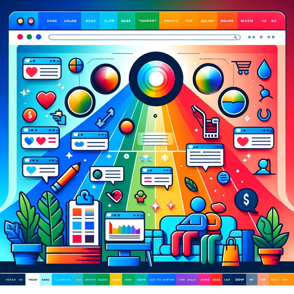
Diving deeper into the psychology of design, let’s explore how color theory dramatically influences your conversion rates. The strategic use of color isn’t just about aesthetics; it’s a powerful tool that can impact user decisions and behavior.
Consider the emotional responses to color. Colors evoke feelings and emotions; they communicate without words. Red, for instance, can ignite feelings of passion or urgency, making it effective for limited-time offers or clearance sales. Conversely, blue evokes feelings of trust and stability, making it ideal for financial or tech companies.
Furthermore, cultural color associations should not be overlooked. Globally, colors carry various meanings and symbolism. For instance, while white signifies purity and innocence in Western cultures, it symbolizes mourning in some Asian cultures. Thus, knowing your target audience’s cultural associations with colors is vital to resonate with them emotionally.
Importance of User Interface Layout
Understanding the layout of a user interface is just as crucial as color theory in driving conversions; it has the power to either enhance or hinder your user’s experience, and consequently, your conversion rates. The layout is the foundation of your website or app, and it’s your first chance to show your users what you’re about. If it’s cluttered and difficult to navigate, you risk losing their interest immediately.
Navigation simplicity is key here. Your users shouldn’t have to hunt for information or click through multiple pages to find what they need. A simple, intuitive layout can guide them through your site, making their experience enjoyable and increasing the likelihood of conversion.
Responsiveness is another crucial element of a successful layout. In a world where users access content from various devices, your layout must adapt seamlessly. It’s not just about looking good on a desktop anymore. If your site doesn’t respond well to different screen sizes, you’ll frustrate your users and potentially lose them.
In essence, a well-designed user interface layout is a powerful tool in driving conversions. It’s about creating an environment where your users feel comfortable, understood, and, ultimately, more likely to convert.
Harnessing Persuasive Design Techniques
Building on the importance of a well-structured user interface, let’s explore how persuasive design techniques can be harnessed to further boost your conversion rates. The key here? Understanding and applying emotional triggers and trust-building measures.
Designs that tap into users’ emotions can significantly influence their behavior. Use color, imagery, and typography to evoke specific feelings and responses. For example, a vibrant color palette can excite users, while softer hues can induce calm or trust. Use images that resonate with your users, and typography that’s easy to read and engaging.
Trust-building is equally crucial. Your interface must inspire confidence. Clear, accessible information about your product or service; transparent pricing; and easy-to-find customer reviews can all foster trust. Remember, a user who feels secure is more likely to convert.
To innovate, you need to combine these elements in a unique and compelling way. Each decision should be informed by a deep understanding of your users’ needs and behaviors. With the right mix of emotional triggers and trust-building elements, you’re on your way to a design that not only looks good, but drives conversions too.

